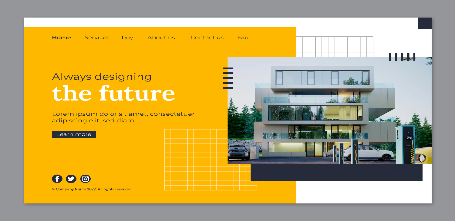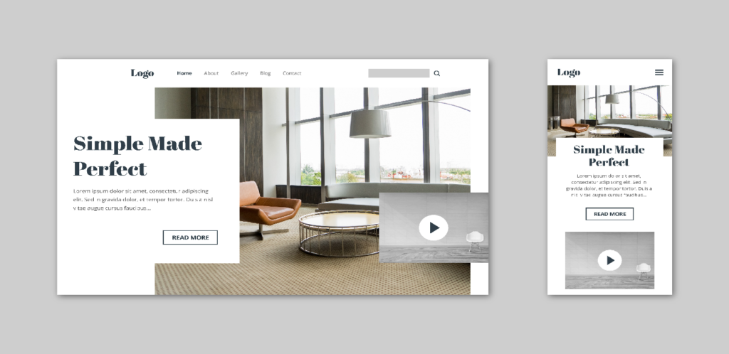
Understanding visual hierarchy is crucial in effective design as it helps guide the viewer’s attention, communicate the intended message clearly, and create a visually appealing composition. Visual hierarchy refers to the arrangement, size, color, contrast, and positioning of elements within a design to establish a clear order of importance and emphasis. Here’s a guide to mastering visual hierarchy in design:
- Hierarchy of Importance: Determine the primary, secondary, and tertiary elements within your design. The most important elements should be prominent and easily noticeable, while less important elements should be subordinate.
- Size and Scale: Larger elements tend to attract more attention than smaller ones. Use variations in size and scale to signify importance and create a sense of hierarchy. The most important elements should be larger, while less important elements can be smaller.
- Contrast: Utilize contrast in color, shape, texture, and typography to create visual interest and emphasize important elements. High-contrast elements stand out more and draw the viewer’s attention, helping to establish a hierarchy.
- Typography: Choose typefaces, font sizes, and styles that reflect the hierarchy of information. Headings and titles should be bold and larger in size, while body text can be smaller and less prominent. Use variations in font weight, style, and color to distinguish between different levels of importance.
- Color: Color can be a powerful tool for establishing hierarchy and guiding the viewer’s attention. Bright, saturated colors attract more attention than muted or desaturated colors. Use color strategically to highlight important elements and create visual contrast.
- Whitespace: Whitespace, or negative space, plays a crucial role in visual hierarchy by providing breathing room between elements and directing the viewer’s focus. Use whitespace effectively to separate content, emphasize key elements, and create a sense of balance and harmony in the design.
- Alignment and Layout: Organize elements within the design using alignment, grids, and layout principles to create a sense of order and structure. Aligning elements along a common axis or grid helps establish hierarchy and create visual cohesion.
- Visual Cues and Gestalt Principles: Incorporate visual cues such as arrows, lines, icons, and symbols to direct the viewer’s attention and reinforce hierarchy. Additionally, apply Gestalt principles such as proximity, similarity, and continuation to group related elements and clarify their relationship within the design.
- Hierarchy in Interactive Design: In interactive design, consider how user interactions and feedback can influence visual hierarchy. Use animation, transitions, and interactive elements to guide the user’s attention and provide visual feedback based on their actions.


By mastering visual hierarchy techniques, designers can create designs that effectively communicate information, guide the viewer’s attention, and engage the audience in a meaningful way

